Researching 3 Different Pictures
This image is a line drawing/sketch of Iron Man. I like the style and the way that it is drawn. It's an older version of Iron Man giving it some classic style to it. Also the fact that he looks the way he does in the comics, this makes it appeal to me more. They use of Action has been applied to this image. The explosion gives the picture some movement and feel. This makes the image stand out.

This is an image produced by Nico Di Mattia and is painted on Photoshop from scratch. He uses a variety of techniques and processes to produce his final image. For example there are a variety of shading techniques involed as well as different lighting effects and glow effects. But the main image is produced from sketching it out on a graphics tablet, and then using the brush tool to fill in with colour and shade. There are a variety of different brushes that he uses to get the correct effect. For example there is a certain brush he will use for shading that has a soft edge which will get the right effect, and a sharper edgier brush that he could use to simulate battle damage. I like this image for it's attention to detail as well as realism. I also can appreciate the time and effort that was put into this piece because the final outcome is outstanding.

This is an image from a trailer for Battlefield 3. I have screen shot a still of the trailer to show some of the techniques that the designers have used. Here we can see that the U.S Marines are being deployed out into a city. As they are climbing out of the F.A.V we can see the use of lighting. At the door above the marine we can see a red flashing light. This is clearly being shone onto the marine and bending around his body. There is also the use of shadows and darkness where the light isn't. This is a very good part of the trailer because it generates realism. having a warning light as you are being deployed into a battlefield really puts you in their situation, which the game is trying to do.

From the same trailer we can see that the game engine has the capacity to show motion blur. We know that when you move around, nothing stays static to your eyes. This also looks photo realistic, which means the designers have researched the surroundings of the area of the setting. In this case it would be Iran and Iraq. Also the research of the weapons that the marines are using. Standard issue assault riffles are obviously what you will be seeing most of in the game. This means that the designers have to have a good idea about what the weapons look like, feel like and sound like.

This is a good example of lighting in his picture. It gives an idea of the humidity and climate of the country giving a realistic feel to the player. Different tones and contrasts make the lighting even better. This particular screen shot is just after the marines have exited the vehicle. as they get out the player is slightly blinded by the light, this is because of the darkness inside of the vehicle dilates your pupils more, sudden exposure to light gives a sharp vivid effect to the screen. I like this because it puts you in the shoes of the marine, as any first person shooter should.

This is a image that I found on
http://creattica.com/vector/graffiti/19592. I like the style of the brush and patterns used. It makes the picture stand out being in pink on a white background.
This image was found on
http://www.webcoursesbangkok.com/blog/business-card-design-indesign/. It uses patterns to demonstrate how to make something, in this case it is a card design.
Websites like Bebo and Blogger allow you to choose a website background for your individual page which can consist of different images and textures. Textures like a brick wall background give the webpage definition and texture.

Another website that uses texture as their background is Republic. They use the white brick wall background because it fits the style of their website.
Alan Becker

Alan Becker is a animator and is famous and known for creating the stick man series of Animator vs Animation. This is a new and revolutionary idea that has been viewed across the world on his website and on YouTube With over 1 million views on each of the animations, Alan has been asked to do tutorials on how he creates these animations. And he has now set up a tutorial YouTube page to show you how. He has interest in digital art, entering may different contest and he has headlined on deviant art.
Screen Shots
Alan Becker uses adobe flash to create his aanimations. He encorporates a frame by frame system so that he can get the somoothest outcome for his animations. What i like about his animations is how imaginative he is with his work. There has always been "stick fights" on the internet and it is hard to create one that stands out. Alans idea "animator vs animation" is something new in the subject and is very well animated. It is humours and clever. Well thought out and took him over 1 year to make. The idea is the only one of its type on the internet and he is now famous for its creation.
Vitaly Bulgarov
Vitaly is an award wining 3d digital artist that is currnetly working in Blizzard as a conceptual artist and is one of the best in his field. He started free lance work about six years ago and then stated to work for a Russian Game company, and also stated working for some american and European companies.
Banksy.
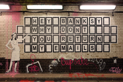


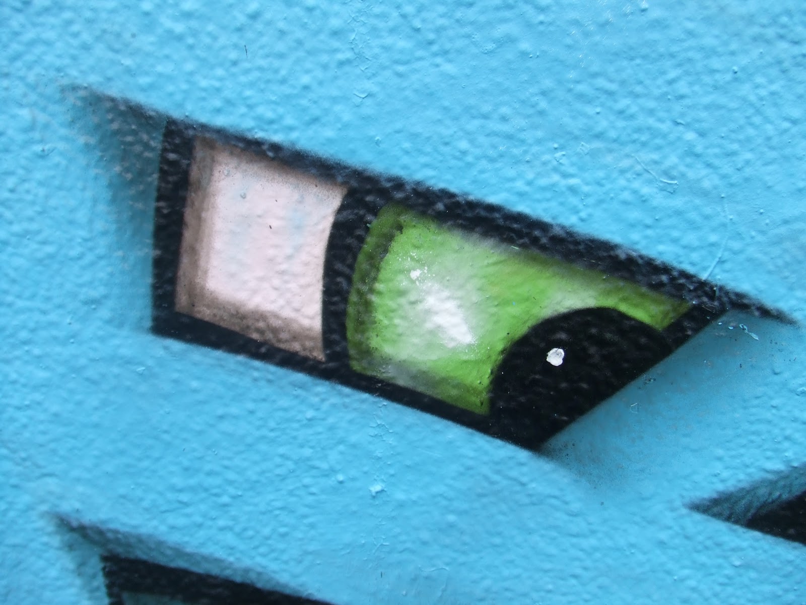
Banksy's art is one of a kind. nobody knows who he is or if there is even more than one person. All we know that his work stands out in a huge part of art because of the questions he raises. His art is controversial and gets attention because of the places he puts his work. I like his work because of the style it is presented in. for example, the stencil like graphics he creates are very recognisable.

David Carson is famously known for his work using Typography. His creative and enspireiring ideas have been in magazines across the world. He was the art director of the magazine Raygun. He was considered to be the most influential graphic designers of the 1990's, so much so that he defined an era of graphic design.
Throughout his career he continued to out shine other graphic designers. He not only owned magazines but also was a professionally surfer, qualifying 9th best in the world. He has worked for a variety of different companies including Microsoft, Armani, Nike, Levis, British Airways, Quiksilver, Sony, Pepsi, Citibank, Yale University, Toyota and many others.
Since 2010, he has lectured, held workshops and exhibitions in France, Portugal, Madrid, San Sabastion, Los Angeles, Novi Sad, Serbia, Ukraine, Sweden, London, Argentina, Brazil, India, Chile, Germany, Italy, Australia, and various states in the U.S.


Story Board

This is an example of a story board that I found on the internet. I like the way it is laid out in a simple and clever style in which no detail is shown however the movement and actions are clearly displayed. Also I like the way that little notes are dotted around the frames. This is a good idea because it is like a little reminder so you add the detail in the animation.
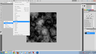
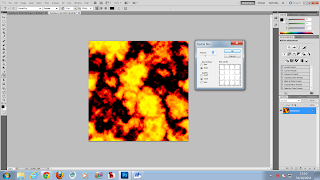
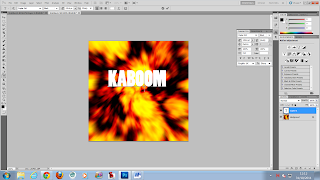
This is the storyboard that i have created using Photoshop. Based on the research that I have done I made the storyboard quite messy and quick. It has the basic and clear idea down that the stick man kicks the title and then it explodes. Also i used quick sketches and captions to remind myself what the text is support to do and what it looks like.