
This is an image I created using the images that I gathered in Astor park. By laying the images on top of each other and then using an opaque eraser brush on a low opacity setting to give the picture a blended effect.

Using Photoshop, I sketched out my ideas for a tag. Having already done some work on graffiti, I got some inspiration from that. Looking at some of the pictures I took at astor park, I wanted to use some of the ideas for my tag.

To create this tag i simply used a black rectangle shape and rasterized it so i could edit it. I then used the text tool to create some graffiti like text and used the character window to edit the size, shape and position of the text. then i rasterized the text so that i could created the spray paint glow effect around it. I then added a splatter of paint shape, next to the text, to give itt a graffiti look.

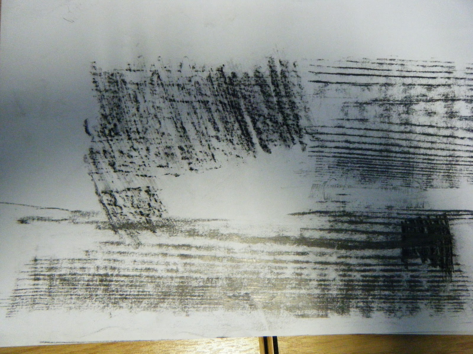
This is a rubbing of a wood table. However the rubbing does not show it very well because the wood was old and didnt have enough dips in it to give it shape.

This is of the toilet. I thought this would be good to do because it was the first thing I saw. Also it is the best shape that i found and when i used it in my pattern design it proved to be one of the best.
This is my animation for the cover of an interactive magazine called Kaboom.
To Create this animation i used Photoshop and Flash. By creating the images in Photoshop I was able to get better images. However animating them the way i wanted would have caused problems in Photoshop. Therefore i had to use Flash because i would get a better final outcome.
I had to created several text images, for example the "Kaboom" and the "magazine" I created in Photoshop using the text tool. I then decided to give the text textures becasue that is what we have been doing in this unit. To create the texture in the "Kaboom" i used a glow effect and the noise tool. For the "magazine" I selected teh text pixels and then on a new layer used filter-render-clouds. I did this several times and used the gradient map tool to give it an explosion effect by turning the colours into whites and yellows.
I also created separate images of the same text with a blur effect. This is for when the stick man flips and hits the text. The glow makes it look like it is exploding.
I animated the stick man in Flash because it was an easier programme to use. It also makes it easier to achieve what i was going for. I used a flip book style drawing, creating a new frame and using the onion skin tool to draw him on each frame. I also used this same process when the text "innovation in art & design" is animated onto the screen.
Using all of these techniques and processes I achieved a short, fluid, entertaining animation for the title screen of an interactive magazine.
No comments:
Post a Comment