


These are some of the images that I took using the digital camera. I then put them all together to make a Photoshop piece.

Using a base image off the internet i manipulated it using typeograpghy. By selecting the face area i used a sentences to fill the space, then copied and pasted it until the face shape was full. For the hair i used a bolder type face to signify how dark the hair was. And for the shading i used blocks of text and simply masked them on top of each other creating a darker shade for the side of her face.
To create this animation i first stared by rendering the the cloud effects by clicking on the filter tab and selecting render and clouds. I then rendered different clouds several times to create a sort of explosion effect. Then using a gradient map i created the fire colours. I then created 2 pieces of text and put glow effects around them as well as bevel and emboss. The i selected the animation tab and selected the text which i moved out of frame. Then i used the duplicate tool to duplicate the frames and in the 2nd frame moved the text back into shot. I then clicked the tween tool and made sure that the frames per second was correct and made the frames last for 0.2 seconds each so that you can see the animation clearly.

To create this pattern/texture, i first got the base image of a cabbage and used the letter "G" in a nice font that would go well with the picture. I then used the hue and saturation tool to change the colour of the image. Then by flipping and copying and pasting the segments, I came up with this cool pattern. I then added a filter effect over the image to give it a watery look.

Using the selection tool I created some text and selected the pixels. I then deleted the text layer, and inverted the selection and deleted that. This left me with the text with the pattern on top.

This was using the same technique as before, however this time I put the text selection on a different layer and put a black background under the image. I then moved the text slightly giving it a shadow effect.

Using the same technique as with the text, I applied it to a jet.

Here I used hue and saturation to change it to pink.

This is the finished pattern using the same techniques as the demo.

This was the stencil.

This was the original image, then I created a "L" over the top to make a pattern.

This is the final Pattern.

This was the stencil.

I cropped this image and then used the letter "J" to create the stencil.

This is the final pattern.

This is the stencil. Using the rubbing that I got form around the area, I created this cool wood effect.
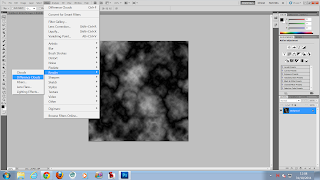
For this demo we started to make an animation in Photoshop. Firstly we rendered some clouds using the filter, render tool.
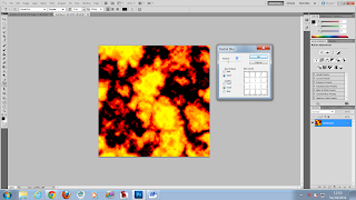
We then used hue and saturation to create an orange, fire effect. This made the background look like an explosion. After that, we used a blur tool called radial blur. By using this tool we could give the explosion some motion and feel.
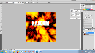
Then we added the text to our image.

After that we added text and gave it glow effects so that it would blend in with the explosion. Then it was simply a matter of tweening the animation. We created 10 frames and place the text out of the frames in frame 1. Then in the last frame we put them in the centre of the image. Then by adjusting the frames per second and how long that they were displayed for, we got a nice smooth animation.
This is the final outcome of the animation. Combined with all the techniques and processes i produced an animation in Photoshop.
No comments:
Post a Comment